
I like movies that are aware of what they are selling... without [any] greater aspirations than to make people laugh and that's it.
... View MoreThis movie feels like it was made purely to piss off people who want good shows
... View MoreGreat movie. Not sure what people expected but I found it highly entertaining.
... View MoreThere's no way I can possibly love it entirely but I just think its ridiculously bad, but enjoyable at the same time.
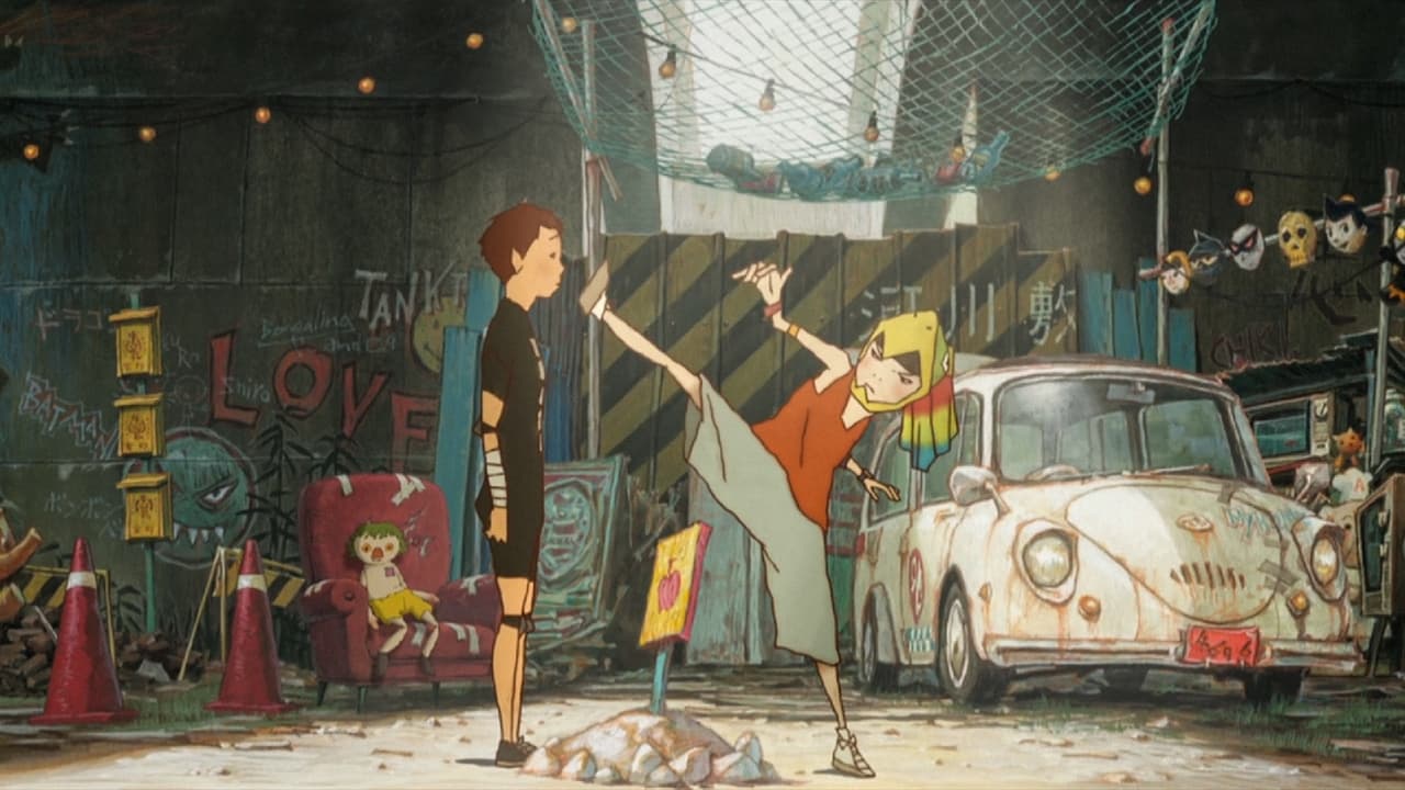
... View MoreI enjoyed all the eye-candy artwork and amazing camera angles! The bond between the two, Kuro & Shiro, is very heartwarming... The action is quite good and it was worth the watch...
... View MoreThis movie is quite something, I didn't know what to expect when i bought the DVD online, But i did make the mistake of allowing my 8 year old little sister to watch it with me without first watching the movie myself, Not that she didn't enjoy it but some scenes were inappropriate with sexual references, Gore and Disturbing Scenes. But luckily she was too young to understand most of it. (the UK age rating is 12 but i would disagree and bump it up to a 15)Anyway, This movie was quite a beautiful movie, with stunning scenes which are very detailed, The English Dub is surprisingly great (Most dubbed anime tend to be quite bad) The music is beautiful, So beautiful in fact, that i felt compelled to buy the soundtrack. The story is Gripping and Emotional and sometimes a bit confusing but once you think about it then you get to understand it easy. The characters are very likable (especially the younger brother, White) The animation style is unusual but it has a certain "je ne sais quoi" =DAll in all this is a very attractive movie and a Moving one too, every time i see it i really feel emotion and at one part (you will see when you see it)it actually makes me well up with tears.I highly recommend this to everyone over the age of 12 (but i suggest parents to watch it before letting your children watch it XD)
... View MoreIf not quite the genius level of Miyazaki, this is still different, thoughtful and original.It involves two 13 year old boys, Black and White, who live in a run down imaginary city, and who have to fight developers who want to take the city over, and in the process destroy it. Black is dark and angry and needs White's almost Down's syndrome like simplicity and sweetness to balance him. Obvious and heavy handed on a symbolic level, ('Black' and 'White' as character names?) some of the animation is breathtakingly beautiful, although the faces of the characters lack a certain expressivity. It's more the backgrounds, the world itself, and the sort of mock stedicam moving shots that are so striking.See this in a theater, or at least on a great TV via blu-ray if possible. It's such a visual piece, that seeing it in any lesser way makes it likely to miss the film's greatest strengths.
... View MoreI saw two films here. One i cared about, and another one that made me bore.the city:there are strong visual ideas behind the good Japanese animations. This is a feature that has two sources, according to my interpretation: one is very notion of image int art and Japanese culture. Japanese art produces now and for many centuries before images which are as complex as pleasant, they have abstract concepts, but they are visceral in the way they touch the viewer. So, art in Japan (when really good, and really Japanese) has this double component, of being highly intellectual and highly attached to the public it hits, no matter where that public comes from. That's why it's been relatively easy the process of turning Japanese culture into an universal matter (at least the 'image'(s) of the Japanese culture). The thing that amazes me is how quite different Japanese creators from different areas and different forms of expression tend to be highly coherent between them, even if not directly related. The other source comes from a certain form of expression which, once, cinema explored. i'm talking about expressionism, and the direct influence that the German films from the 20' had in so many creations afterwards. Metropolis might be the most visible face of this influence, but films like Der Golem have today still a strong impact. This film is basically a product of these two (main) influences. We have a city, which is magnificent, coloured but dark (and, as the two main characters, 'black' and 'white'). This city is worth exploring. It's powerful, and it's visual. It's visual in a false two dimensional perspective. That's because the images are more based in texture, color, and framing, than on 3d distances, point of view or perspective. So it has more of Metropolis than of Blade Runner. But it is false because the Japanese are very strong in reducing the means without loosing content. Which is to say, the deepness is all there, even though the image is apparently flat. So, this is a city worth visiting, and, no doubt, the strongest point in this film.storyline:this was, on the other hand, quite disappointing. It made me bored to follow the threads here. Black and White, the film revolves around the connection between them, and we have some other lines to follow around. The old moral gangster, his almost-sun who is forced to kill him, and the superior forces (those who live on the sphere above everything. The concept was quite simple, a kind of ying-yang (as in fact is shown along the story in the shirt of our Black), trying to understand how opposites get attracted (and repulsed) and how the bounding between those opposites creates a 'perfect' relation. But there was too much noise. The kind of 'noisy silence', 'dark coloured' city we had, is totally gone in what concerns narrative devices and storyline. There is only one point of interest, because it's visual and worked with the possibilities of the medium. The visions of White, which he draws, become often animations, with a totally different expression from the rest, allowing us to take it as something really drawn by hand. Those were powerful moments. But the rest wasn't pleasing or interesting to follow, and in the final minutes, the whole thing falls apart, precisely when the city is gone of our site, and the whole graphic expression changes into something that doesn't fit.My opinion: 3/5, check it for the city...http://www.7eyes.wordpress.com
... View More