Trending Searches:
Popular Movies:

Admirable film.
... View MoreThe best films of this genre always show a path and provide a takeaway for being a better person.
... View MoreClose shines in drama with strong language, adult themes.
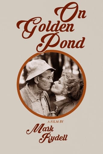
... View MoreExactly the movie you think it is, but not the movie you want it to be.
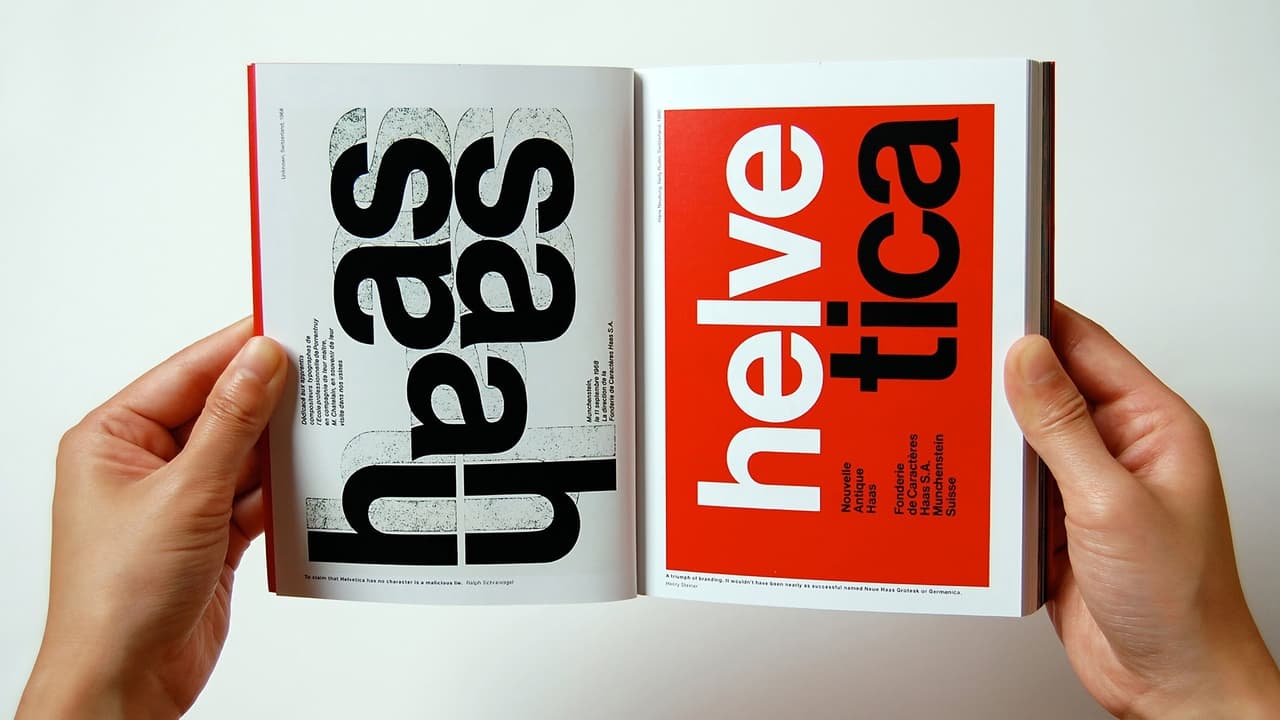
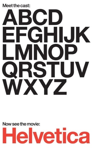
... View MoreA documentary about typography (including but not limited to the Helvetica font), graphic design, and global visual culture.So, you might wonder how 90 minutes about a font could be interesting. That must be among the most boring things in the world, right? Not at all. We learn about the whole story of modern typography, and how hard it used to be to design a single letter.We learn that there is a political message to letter shape choices -- to one woman, Helvetica is the font associated with the Vietnam war (and also Iraq). We get a certain feeling from different shapes, and this is one of them.One man asks, is there a science of aesthetics that explains why this font is the perfect one? Why no one has been able to improve on it in 50 years? I find that an interesting question. No math went into designing it, but somehow it has an intrinsic style that seems to be the way we now view language.
... View MoreAt its core Helvetica is a documentary about the creation and widespread use of the typeface of the same name. If that sounds boring to you, well guess what, it often is.The film, directed by Gary Hustwit, begins with the birth of the typeface. It was created in 1957 by the Swiss with the hope to create a "perfect" sans-serif typeface. As a side note, a serif is apparently the little "feet" type accents that are on letters of certain typefaces, for example Times New Roman is a serif typeface. The film speaks with several type designers, a profession that I was unaware of, including the designer of Helvetica. Once the viewer has been given an adequate background on the typeface itself, the film begins to change. It wanders away from the typeface itself and becomes a documentary about graphic design. Graphic designers express both their love and hatred for the typeface as well as its effects on the larger world of design, becoming more of a film about modernism and post-modernism as it applies to this world.Throughout the film, the director goes out into the world to shoot different signs and postings that utilize Helvetica. At the beginning, this is intriguing, often surprising the viewer with just how often this single typeface is used. However, as the director employs this technique more and more often, to the point where it seems built into the transitions, it becomes annoying. By the end, I felt like I was just being shown the same images in a film that no longer was truly just about the typeface itself.If I were a graphic designer I may have found this film more intriguing and interesting, but sadly, this is not the case. It is shot well and the interviews seem to give a balanced opinion on the use of the typeface, but as a film, it is stretched thin, feeling overlong at its lean 80 minutes.
... View MoreAs many others have already said – a documentary film that appears to be about the font Helvetica (or indeed any font) is hardly something that is screaming out to a wide audience or likely to be screening to packed crowds in the American heartlands. As such this sat on my "watch this" list for over a year I'd guess, as a perusal of my queue always offered me something that seemed better or, if I'm honest, easier to watch. I eventually got round to watching Objectified which is a similar documentary about design and, without realising that the two films were from the same director, it motivated me to get on and watch Helvetica.Like Objectified I found that the film did a great job of laying out the topic in a clear and accessible manner. It builds a very effective and engaging discussion on the font in particular but also the wider arena of graphic design and typefaces that are all around us. The structure of the film is the foundation that makes it work – it doesn't jump into the deep end of the topic and it manages to be suitable for the casual viewer (which I am) while also avoiding being patronising to those that work in this sector. This is the groundwork and it is well built on by the selection and use of a very good collection of designers and experts in the field – almost all of whom are passionate, well spoken, interesting and, most importantly, not "up themselves" or self-important in the way that some of those in design or art can be.These talking heads help the film maintain an open, accessible approach while the visual design and packaging of the film itself keeps everything lively for the eye and the ear as well – never going into the realm of a dry academic approach to the topic. So yes, Helvetica may sound like it is going to be a very niche film and as much fun as a holiday slideshow from a dull uncle but it is actually light, accessible and engaging due to the structure and design of the film and a great selection of contributors.
... View MoreThis is surely the best documentary I have seen. I use several metrics in this.A film is almost without exception a story. A documentary is usually presumed to be a found story, an existing one that the filmmaker merely exposes. We come to the thing expecting some coherent story, already formed, the problem having two threads: Can we trust the filmmaker? Does the story resonate? Often a solid position in one mitigates the other.But real life at least the life I know has no stories that are blunt. Real stories, the ones that weave themselves through the world, are rich, only somewhat visible, immensely intriguing and often educational. I expect to be puzzled. If there are "two sides," I immediately mistrust the teller, because true movement is simply itself.This film should be celebrated simply because it decides to present a story in its unformed state. We hear from designers young and old, clever and not. Some are geniuses and some see the genius of design and we have no idea which is which. They report profoundly different views on a typeface. Lest we think this is an irrelevant subject, the observations on the typeface are bridged by examples to show how thoroughly it has saturated. So we are left with the same form as "Ten Tiny Love Stories," perspectives that surround the notion and instead of pulling out the answer, illuminated the mystery. The simple fact is that this is a powerful, mysterious force that makes us do things. The comparison of font design and romance is not misplaced: both somehow relate to the bricks of stories we use in constructing a life or for some of us a fort to protect from life.So I can recommend this to you. I recommend seeing it with your partner, your real partner. And then sit with them quietly and reflect on the nature of clarity and knowing.I can criticize this though. There is much that could easily have been said that wasn't.Its usually presumed that spoken language is quite old and written language a relatively modern technology compromised to make it persist. In this context, type design is merely a matter of style, a choice.But there is evidence that spoken language predates modern humans and evolved over time through collaborative toolmaking, most particularly weaving and stonechipping. Acts of hands. Shapes -- physical form, with symmetries. Spoken language in this history is itself an adaptation, and written language perhaps closer to the core of how we think. In this history, shapes matter. The process of creating form in story all manner of form matters. The story is how the story is shaped.We bump against this intuitively. It was why the Macintosh was a giant step forward in the 80's, because storytellers could for the first time be storyshapers (publishers, in the corporate lexicon). And why Microsoft is such an evil. And why type design elements have become so deeply viral. The original features come from carved inscriptions and independently from monks' pens.Anyway, from that Mac beginning came a focus on type as never before. And several design journals that struggled with the issues spoken about in this film. Pulling them out of print to put on screen should carry some more weight than we have here. I am hoping that some truly talented filmmaker is inspired by this.The most edgy but still intelligent design and font design journal from the last decades is "Emigre," which you should peruse if this movie intrigues you. Also you might want to check out Darius, who was behind the first designed font.My typeface is Vendetta.Ted's Evaluation -- 3 of 3: Worth watching.
... View More